Building Arcadia – an Environment Design Devlog for a Metroidvania anime style
- giuliamccolombo
- Jun 30, 2023
- 6 min read
Updated: Jul 1, 2023
In a Metroidvania like Arcadia, the environment plays an important role in gameplay and storytelling. In this Devlog we chose to show the first area that we designed and how we came up with the anime style from the concept art to the actual game.

Case study: The Citadel
The whole concept of Arcadia’s world blends technology and natural environments to create a single interconnected Colony built into the underground. The Colony is divided into high-tech and natural biomes creating a solid balance and connection between what the settlement was and what it aims to be.
For every habitat, we chose a specific colour palette for each environment so that they are easily recognizable and have a strong contrast with the dark purple we used for enemies. Because of that, we wanted obstacles and puppets to look alien and completely unfit for the environment so that you could tell something went wrong and there was an invasion. The world of Arcadia bears the wounds of enemy’s presence.
The Citadel palette is the only exception in the game that matches the colour of the first enemy.
The Citadel
Being built underground, the first step to design The Citadel was to understand what kind of city could work in a cave and how this feature could affect the mood of the entire area. To do that, we created a moodboard of images: anime, tv-shows, etc. So, the first design was inspired by contemporary architecture, showing how the bunnies used their technology and buildings to live, play and prosper.

the first mood board
The references together gave the first art direction making an environment with many trees, wonderful skyscrapers, and neon lights. We also studied some traditional Japanese architecture and contemporary west Asian city details and Japanese culture like Kanji, signage and so on. In the end, The Citadel is deeply inspired by 90’s Tokyo, with colourful neon lights.
Citadel’s Skyscrapers
After defining the mood, we have to design city details. We think about buildings, in particular Skyscrapers.
Skyscrapers are the best building to describe the rise of modern civilization, but we ran the risk of creating a Gotham city look because of the underground darkness. However, The Citadel is a vibrant and peaceful place, destroyed by the enemies' presence. We used simple soft shapes for the buildings and nice colours, with a lot of pink, light blues and warm yellows.


Creating a vertical city also helped us understand how to connect different levels with bridges to make the environment more dynamic in composition and mood. As you can see, the first palette had a lot of red lights and cool yellows that were discarded in the final images because they give a dangerous look to the area.
After defining the mood we needed to think of specific architectures based on their use.
Living in a cave, we supposed they must have thought of something to avoid landslips or at least something that could keep the roof up, like pillars. The first building is inspired by this idea in shapes and functions. It’s a strictly residential palace, with a bigger trapezoidal roof that keeps the rocks far away from the streets.

first sketches of Pillars and Greenhouse

Pillars Building
The second skyscraper type is the Greenhouse. This is the most technologically advanced structure, where all the colony’s food grows. Its special task is shown by the different silhouette and the colour, a light blue/white as contrast with the purple background. In the first level design, we thought about using them as a platform, or a special area that can be explored but this idea was discarded in the final game, and now it's a background element.

The first sketch of the greenhouse

Greenhouse’s Roof
As for the Greenhouse roof, we also thought of different variants for the standard skyscrapers to give the impression of a realistic city. The main elements for these variants were different rooftops, lights and shops.
We designed four different rooftops: the green roof with vegetation, the generic area with advertisements, the one with generic fixtures and a bar rooftop. These elements can be mixed up and used as modular parts for all the backgrounds.
The shops are mostly ramen bars, restaurants and hot springs inspired by real Japanese streets. Their fronts are also decorated with lanterns and props. Advertisements also were inspired by Cyberpunk classics like Akira, and Blade Runner. You can also spot some Easter eggs and inside jokes like the peanut’s presence that you can find in all the environments game with different aesthetics.


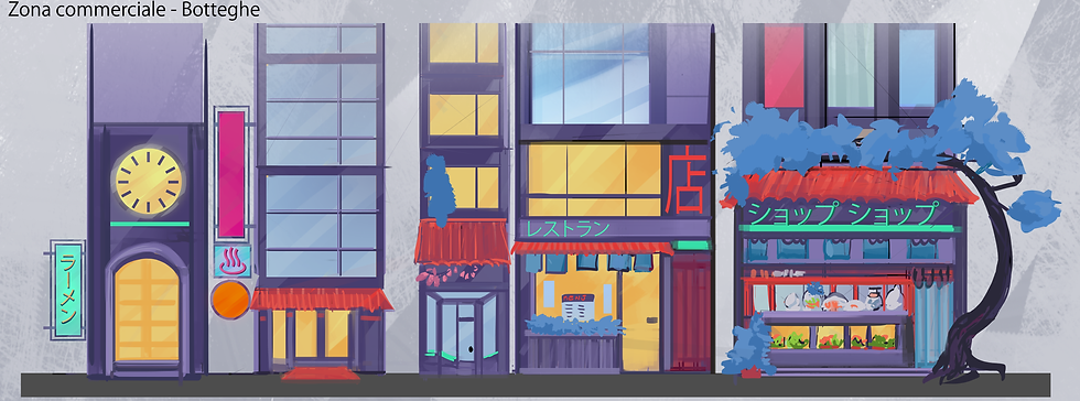


The Citadel’s Urban Planning
The level design required a specific theme for each area to help the player explore the Biome, so we thought about using real urban functions.
We came up with five zones: the Commercial zone, the Main Hall square, the Mayor’s Office, the Skyline and the Train Station.

The first level design concept of Citadels
The Main hall square is defined by a big pink tree and a lot of vegetation, fewer shops and more lights. It’s influenced by contemporary squares and you can see the Main Hall front. We thought about a big old building made of bricks and covered by ivy. The inspiration came from the old Western buildings in Asia, but we decided to give a contemporary twist to it: a big glass structure that represents the power of technology and the Colony’s prosperity.

In the Main Hall, you can enter the building and find The Mayor’s Office. It's also the place where you find Ashley for the first time, the area manager. The room is designed to show Ashley’s personality. It’s a cozy ambient for a girl-boss character, full of storytelling details that the player will discover later in the game.


The Commercial Zone and the Skyline were the fastest to build thanks to the concepts we analyzed before as they only needed to be modelled and placed in the game with some variations.


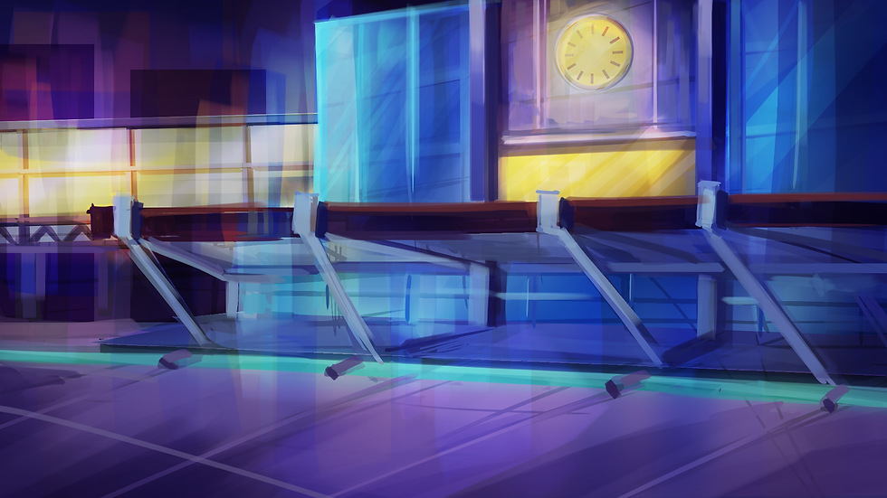
The Train Station is where you meet the puppet and they are right next to a big clock that divides the boss fight from the platform area. We made two concepts for the Train Station: the first one in which the building is still functioning and the second one in which it has been destroyed by the giant mech. The structure is a direct reference to the Yaesu side of Tokyo Station too.
Mixing 2D and 3D assets
Environments must reflect the anime style like the characters. This aesthetic was achieved with texturing and shaders. In Japanese animation, the background generally doesn’t look as flat as the characters and tends to have more realistic lighting and material rendering details, preferring not to use outlines of outlines. This happens a lot in Studio Ghibli movies and Studio Trigger anime like Little Witch Academia or Kill la Kill. These characteristics were important both in concept art and in texturing. We tried to use a painterly rendering and realistic lighting trying to mimic Studio Ghibli’s iconic vegetation in contrast with the high-tech buildings.

first concept art of the game scene of The Citadel
At the time we didn’t know if we would use an orthographic camera, but after studying different games of the same genre, we decided to mix 3D objects and 2D planes. This also allowed us to place 2D objects with the intent of recreating a hand-drawn painting.
So, 3D objects played a big role in the Biome environment. We chose to create models for buildings, obstacles and surfaces the player interacts with. We kept all the models with a low poly counts and tris to help optimization. The buildings were also split into simple modules. This approach gave us the freedom to dress the levels with fewer objects and without worrying too much about the game performance. Thanks to this trick, we could work on details and specific props and building details. In this image, you can see some of the buildings created for the skyscrapers and shops in Blender with some combinations tested.

2D objects were useful in this phase to make in creating parallax effects and highly-detailed backgrounds that give the world an authentic and lively style: what you see in the background tells you a story about how big the Colony is but also helps by making the environment less repetitive. 2D was also used for the window parts, lanterns, fire hydrants, and vases.

Dedicated shaders
Because of 3D models, the main problem was mimicking the 2D effect of an anime background. As we did for the character, we chose a package from Unity’s asset store called Quibli from Dustyroom.
Quibli is a package that specifically recreates the iconic style of Anime movies in a 3D environment, with a good combination of texturing, shaders and post-processing.
We used the Stilyzed lit on all the buildings and vegetation materials to obtain visual consistency and the Quibli Skybox shader for all the skyboxes in our game.

For the foliage in particular, the Quibli package allowed us to recreate a recognizable style through a cloud-like mesh that generates hand-drawn leaves, with different shades of the same colour.
Emissive maps were also important for the neon lights, but the post-processing created the underground mood.
We used Universal render Pipeline in the Unity engine and worked to balance all the purples with the blue backgrounds. This is a phase that occupied a lot of time because, in the first iterations, there was too much purple and too much bloom on emissive. At the time we had good post-processing that worked well in a specific scene, but it made all the other scenes in the Biome feel repetitive and we ran the risk of having something not only boring but also bad for the players' eyes. The final result was achieved by using more blue in materials and creating a little more contrast in the vignette effect and the final look it’s a good compromise between gameplay and mood.

Global Volume

first post-processing test

final post-processing
Comments